
 ACanonGuy 於 2010 年 4 月 19 日 上載
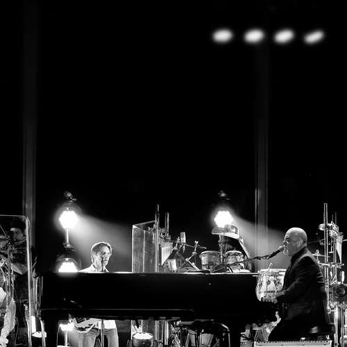
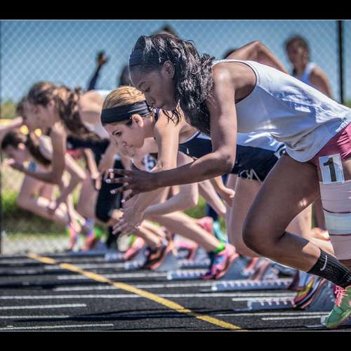
三色三人行
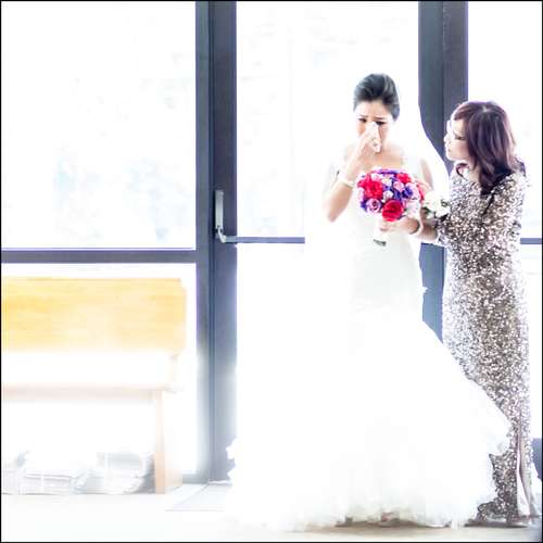
Out of the three versions I like the one above more where I toned down the saturation for Green and Aqua. This makes the red and blue stand out a bit more. The one below is its original colors. B&W is also cool for wedding picture but not sure about this one since not much contrast there.


13
讚好
讚好
1.2k
瀏覽
瀏覽
14
回應
回應