
會員回應 (25)
會員回應限期已過!
-

-

-
paboy @2003-05-03 12:13:08Thanks ar hoi 's suggestion. I will try later.
-
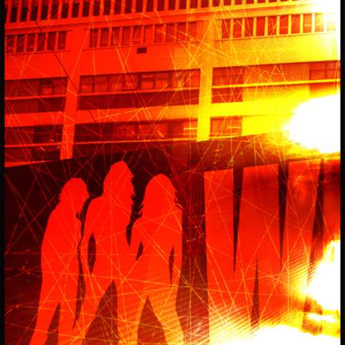
ar_hoi @2003-05-03 10:20:28Hi paboy,
i think midori knows very well about what a good signature is.
Look at what she did with "isolation" that is a nice and well balanced one. jesstrunks also got good signatures for your reference.
To an extent, There's no objective right or wrong with typography, i.e. it is really a personal thing. :) May be it's me being overly critical here :P
IMHO, the use of "font=impact"is quite approiate too...
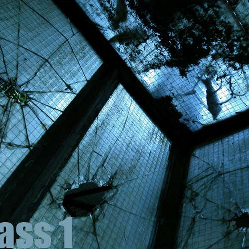
just that the the size of "glass1" overwhelmed the pic slightly. there's room for size reduction.
if you don't wanna change the size, you can make "glass1" "30%(to 50%) transparent" That adds an echo with your subject matter and (to me) works nice graphically.
happy shooting~
I have to stress that I really love your pics :) -
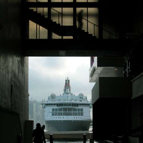
fastmickey @2003-05-03 03:48:17正!!....好夠鬼片 Feel....vote
-
paboy @2003-05-03 00:05:48Thanks :)
-

-
嘉芙 @2003-05-02 17:18:08wonderful picture
-
嘉芙 @2003-05-02 17:17:27wonderful picture
-
 bastard @2003-05-02 16:18:57wow~~feel cool~
 -
ms_mui @2003-05-02 15:19:43cool!
paboy 最近期的作品